"When words become unclear, I shall focus with photographs. When images become inadequate, I shall be content with silence. " A. Adams.

Sunday, 12 December 2010

How text can change the meaning and emotion of an image

An image can speak a thousand words yet when you add text it can speak two. Adding text to an image can completely change the meaning and intent and image is supposed to portray. The text that is added can recreate a whole new story for the image and effects how people percieve the image. What you choose to add to the image can completely change the effect an image can have on its audience and is a powerfull tool in sending a message or provocing emotion. Below I will show an example of the importance of text to project a message on an image and make people stop and think. 


The image above just looks like an ordinary portrait, it could have been taken from a hair advertisement, fashion shoot or even a family photo. From looking at this photo you don’t really get much clue into the story behind the image yet there are many possibilities that you think the intent of the image could be. Now take the same image and add some text and see how the image completely changes meaning.


By adding a few simple sentences to this image it takes an image that could have been used for many different things and adds a serious tone to the picture. It changes a beautiful girl in a portrait to quite a sad and emotional image. Without the text the image projects no emotion yet with the text it becomes a heart wrenching piece that draws on the audience for sympathy and help. The above example shows the importance of text when trying to send a message and how by adding text can completely change to emotion portrayed by an image.

This image was taken from a film poster advertising the film ‘Dark Country’. http://www.filmschoolrejects.com/news/exclusive-new-art-for-thomas-janes-dark-country-neilm.php

Saturday, 11 December 2010

Creative Workspaces

As a designer in a creative industry many people find their workspace is where they collect different materials that inspire them in the designing process, whether it be from books, drawings, flyers, images etc. Artists surround themselves with materials that make it easier to complete the design process. Its from this process that makes each designers workspace an individual environment and unique to each person. Some designers work in messy environments while others have to be in clean and tidy spaces. From the spaces they work in you can get an incite into a designers thought process and understand better their techniques and how their completed works were achieved and developed. Below I have uploaded a few examples of workspaces that I find interesting and can relate to in my own work. 


Unlike some of the spaces above my creative environment changes depending on the project I’m working on at the time. I work best if I’m surrounded by everything I need around me all at an arms length away but also sometimes need to remove myself from that environment and work in a tidy and clutter free workspace. Although I must say I do need background noise to be able to get stuck in, there’s nothing worse than working in a silent room with nothing to listen too! 

Developing Ideational Fluency

Developing ideational fluency can come in useful as an artist as it helps you to expand your mindset from producing one idea into several different ideas. Commonly achieved through brainstorming you can take one main subject and write down everything and anything that comes into your mind when thinking about it. This then develops into mind mapping, where you take the ideas you thought of during the brainstorm and organize them so they work together with each other creating new and initiative ideas that you might of never thought of or thought possible before completing the process.
While brainstorms usually consist of noting down words, mind maps involve more visual examples of working. Images and illustrations help to show the developing thought processes and show in wider detail the creative thought processes occurring around one idea and how the artist has come across them.
Below is an example of the difference between a brainstorm and a mind map. By looking at both ways of extracting ideas and noting them down to be developed both processes work well together as one expands the thought process while the other a more creative process. This results in greater and more creative ideas that are unique to the individual artists. 

Brainstorm.

Mind map.


Tuesday, 7 December 2010

Design Process

As a designer it is important to have your own individual design process and be able to understand how you work best. By being aware of this it allows you to progress through your work easier and better understand fully the process and journey you go through to come up with a completed piece of work. Below is a brief explanation of how I work my way through any new project and develop my ideas in a way that best suits my abilities.

1. Brief – Read through brief and make sure I fully understand what it is asking for.

2. Initial ideas – Note down any initial ideas I may have around the subject and any thoughts I may have. Example below.

3. Research – Start researching into images/ artists/ films/ techniques etc. That can help me develop on any ideas and inspire my project. Example below.

4. Develop ideas – Select one or two ideas that I think have potential and develop on them more, thinking about how I would go about shooting it/ concept behind it etc.

5. Research – Research further into a more specific area/ different practitioners/ techniques that relate to my ideas and that I can draw inspiration and develop on. Example below.

6. Final idea – Find one idea that I’m happy with and that most excites me and perfect it. Example below.

7. Plan – Plan how I intend to go about shooting this idea, the equipment I will need, location of the shoot, models, makeup etc. Example below.

8. Develop/ construct – Once shot my images develop and construct them into my final piece until I am happy with the work, if I feel the need to reshoot I will then repeat a few of the steps listed above. 


An artists delivery


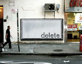
In April 2009 a group of artists took to the streets for a ‘New York street advertising takeover’. Finding it difficult to locate spaces free from advertising Jordan Seiler of Public Ad Campaign organized the event in which over 80 artists participated in transforming 126 billboards in exchange for the individual artists work.

“Public Ad Campaign acts on the assumption that public space and the public's interaction with that space is a vital component of a city's health. By visually altering and physically interacting with the public environment, residents become psychologically invested in their community.
Outdoor advertising is the primary obstacle to open public communications. By monetizing public space, outdoor advertising has monopolised the surfaces that shape our shared environment. Private property laws protect the communications made by outdoor advertising while systematically preventing public usage of that space. “

The quote above is taken from the Public Ad Campaign’s blog explain the point that by law the advertisements were protected but working behind the ethics that they were placed on illegal billboards made it systematically okay to white wash over the advertisements in replacement for artists work. 

Seiler has found a loophole in the law and created a platform to advertise his and other creative work while at the same time staying true to their cause. The artists involved have been able to use the platforms to great effect as people would stop and take notice of a piece of art work on a wall more than thousands of the same posters plastered on there. It is also a issue that could cause debates into the ethics behind the project while transforming a usually bleak and boring space into essentially a piece of art.

Below are a few examples of the completed billboards with the artists work. 


Images and research taken from www.publicadcampaign.com/index.php, www.coolhunting.com/culture/new-york-street.php

Monday, 29 November 2010

Development of Ideas and Structure in Moving Image.

Three Act Structure.

In all films there has to be a general structure to the story, the most essential elements being a beginning, middle and end but not necessarily in that order. A recent film I have watched which shows this is ‘You Again’. The film is set out with a traditional layout of beginning, middle, end - establish, crisis, resolve.
The beginning of the film lays out the general outline for the story which in this case is Kristen Bell’s character Marni who returns home for her brothers wedding only to find out he is marrying her school bully Joanna, played by Oudette Yustman. Marni is determined to show her brother the real person he is choosing to marry and sets out to reveal Joanna’s real personality.
 The story then develops onto the crisis or the middle outline of the film. This is when Marni is setting out to destroy her brother and Joanna’s relationship, while at the same time is failing and becoming more and more like her geeky persona she carried around with her at high school. In all her efforts to expose Joanna to her brother Marni succeeds in showing him the real girl Joanna was in school and breaks them up while at the same time loosing her brothers trust and possibly his friendship.
This is when the crisis starts to become resolved moving onto the end of the story. Marni realizes that Joanna has changed since school and sets out to regain her brother’s trust and get the couple back together. Like most love stories Marni succeeds in her efforts and even finds a love of her own with her brothers best friend.
This story is a perfect example of a three act structure in films as each elements are laid out clearly to the viewer and gains easy viewing and a comedic effect of the film. The technique of laying out films into three parts I believe is essential in film making as it allows the viewers to follow easily and become more captured by the creative elements of the story lines.

Digital Storytelling.

Harry potter is a prime example of a film that uses multiple platforms and extended forms to engage its audiences. Not only being a highly successful film series it also stems from the award winning J K Rowling story books, it has several video games, toys, fancy dress and collectables only to mention a few. It’s the clever marketing and production that enables the brand to engage a wide range of audiences drawing them into the whole Harry Potter production. The different platforms associated with the film helps engage a wider range of audience attracting everyone from young children to elderly adults creating its own wide and dynamic fan base. It is from these different forms of storytelling that keeps a high interest within the subject and ensures wide global publicity gaining a higher viewing rate. 

Wednesday, 27 October 2010

Vogue Covers

Researching the content.


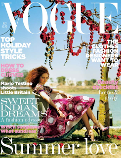
Vogue is a highly successful fashion publication that has been around for many decades. Throughout its time on the shelves it has created its own recognizable brand that has become iconic to the publication. It is this significant image they have created that has to be kept up and maintained to a high standard to ensure the continued success of the brand. Some might argue that it is the cover that ensures this success, as it is what draws its audience to the magazine rather than the many others on the newsstands. Each vogue cover has to represent the brand and has many factors that have to be considered to achieve this. From the photographer, the model, hair, makeup, location, cover stories and the colour of the ‘VOGUE’ written across the top of the magazine, each of these components that makes up the front cover has been strategically planned and thought out and it is the overall outcome that ensures the magazine maintains its high standard and world wide audience. Below you can see a few of my favorite past vogue covers. 


The visual hierarchy of the magazine is also very apparent. It’s clear that the magazines title is the first point of reference for the viewer with the font, colour and typeface all drawing the viewer’s attention to the magazine. It is then the cover image and cover stories job to sell the magazine to the audience meaning that both have to be visually striking and consistent with the ‘Vogue image’. Everything that has been placed on the cover would have been strategically planned and mapped out by a team of people to ensure the best possible response and success from that issue.  The covers I have displayed above may not be the most successful issues to date by I find them visually pleasing and they appeal to me in different ways than they might do to others. The fact that different people react to images and text in different ways is also something that has to be considered in publishing the magazine and it’s important that they find an equal balance to appeal to a wide genre of people. Vogue is a magazine that has been running for almost twelve decades with its first issue published in 1892 and has managed to stay successful throughout that time so they must be doing something right but in the long run it’s the audience that decides the success of the magazine as its them who chose to pick up one magazine from the next whether it be the text, colour or cover image that helps them do it. 


Monday, 11 October 2010

Understanding an audience

Understanding your audience is crucial when creating a piece of work, especially for commercial use. An artist has to know who their work is going to appeal to in order for them to get the ideas and meaning of the project across and understood. For example it’s pointless for an advert for a new state of the art car to be printed in a fashion magazine as its not appealing to the audience the product is intended for. If an artist understands and has knowledge of their audience they can enhance and focus their work on communicating with that specific group of people.


A successful piece I believe that’s in the media at the minute is Banksy’s title piece for The Simpsons. Although very controversial he has taken key issues in society today like sweatshops, child labor and animal cruelty and included them in his own title sequence for the show. The extended sequence apparently being inspired by reports the show outsources the bulk of their animation to South Korea has created a lot of debates within the media. Banksy has never been one to conform to societies expectations and is successful in his work because he knows that he is appealing to a wide audience some of which scrutinize and others that applaud his ability to bring social issues into the forefront of the media and get people talking about subjects that would otherwise be brushed under the carpet. The Simpsons is one of the most successful TV shows of our generation and is broadcast all over the world. Banksy would of known this, he would of researched past shows and known how to appeal to the shows audience whilst still portraying his point. He is communicating with over thousands of people but because he has done his research and has a knowledge of who these people are and what entertains them he has been able to successfully pass his message along to them.


Thursday, 7 October 2010

The Notion of Inspiration


People draw inspiration from many things and find different ways of finding their own individual inspiration.  Whether it is on the Internet, through books, magazines or exhibitions inspiration comes from exploring and finding different medias or techniques that excite us and capture our attention.  I don’t think I have ever been inspired by just sitting inside looking at a blank sheet of paper waiting for ideas to come; you have to go out and explore or even get lost in a place that you don’t know. It is through this that you open up your mind to things you don’t normally notice, wouldn’t normally see or wouldn’t take the time actually stop and look at. Once you have your visual examples you can then sit down and experiment with them. You have the concept and research behind your ideas that make them stand-alone and stand out as an individual piece of work that people can relate to.

When I am starting a new project I always research into photographers, films, artwork or even social events that might inspire me. I love finding new artists that inspire me through their work. I went to Brian Griffins exhibition yesterday and really enjoyed it. It was set up in 3 different locations, two inside and one open air. I loved the idea of having an open-air exhibition as it means your work is open to everyone and anyone. People who wouldn’t usually see exhibitions or are unaware of them can stumble across them and be inspired and brighten up an everyday mundane task and turn it into something memorable. Below are a few examples of how the exhibition was set up.


Brian Griffin, Self portrait


This exhibition shows a wide range of Brian Griffin's photography ranging from his well-known pieces to pieces never seen before. The Location of this exhibition is based outside Birmingham's Snow Hill Station, a station that Brian Griffin used everyday while working in a factory. It was from this job he left to start his photography career. 


Sunday, 3 October 2010

Recontextualized ideas in contemporary culture

Pastiches are another way for artists to recontextualize ideas into contemporary culture. In season 5 of Americas Next Top Model we see the photographer Barry Lategan take traditional pieces of classic art and photograph them as modern interpretations. They picked 5 original art works, all well known and recognizable in modern culture but photographed them how they believed the images would be interpreted today. The works that they chose were; The Mona Lisa, Whistler’s Mother, The Birth of Venus, Girl with a Pearl Earring and Vitruvian Man. These images were shot for an advertising campaign for ‘Quench body lotion’ and by using these iconic art forms they capture a wide range of viewers into the advertising campaign.

Mona Lisa
Mona Lisa, Bre ANTM
Whistler's Mother
Whistler's Mother, Jayla ANTM
Birth of Venus
Birth of Venus, Kim ANTM
Girl with Pearl Earring
Girl with Pearl Earring, Nicole ANTM
Vitruvian Man
Vitruvian Man, Nik ANTM
I really like what Barry Lategan has done with these images. My favourite from the series is 'Girl with Pearl Earring' this is because the expression he has captured on the models face compliments the original image well while still adding something new to the image. Overall i would say that he has successfully interpreted within contemporary culture.


The Notion of Originality


Marine, 1964 Photograph by Julian Broad.

The notion of originality in photography is a widely debatable subject. Nowadays when we have so much access to TV, film, and art it is hard to tell if an idea or concept is in fact original or whether it has stemmed from another body of work, be it consciously or unconsciously. Everyone has originality even when copying work, the setup of the image, how you chose to shoot it and even light it is your own work even if the desired effect is to mirror another image. The work that I find inspires me the most is when photographers knowingly pastiche work and add their own individual twist to the subject.  An example of this I have drawn is from The 2008 Hollywood Portfolio of ‘Hitchcock Classics’ in Vanity Fair. In this shoot photographers took iconic moments from the directors greatest hit movies and interpreted then into images that they believed represented the scenes. 

Dial M for Murder, 1954 Photograph by Norman Jean Roy.
Rear Window, 1954 Photograph by Norman Jean Roy.


Rebecca, 1940 Photograph by Julian Broad.
Strangers on a Train, 1951 Photograph by Art Streiber.
Vertigo, 1958 Photograph by Jean Roy.
Lifeboat, 1944 Photograph by Mark Seliger.
North by Northwest, 1959 Photograph by Art Streiber.
The Birds, 1963 Photograph by Norman Jean Roy.
Psycho, 1960 Photograph by Mark Seliger.